Input Alerts
Input alerts are modal dialogs that prompt the user for input — text, email, password, selections, and more. The InputBuilder provides a fluent API for configuring all of SweetAlert2's input types with validation, placeholders, and server-side pre-confirm support.
Creating an Input Alert
Use the input() method on the Alert facade. The first argument is the title, and the optional second argument is the input type (defaults to text):
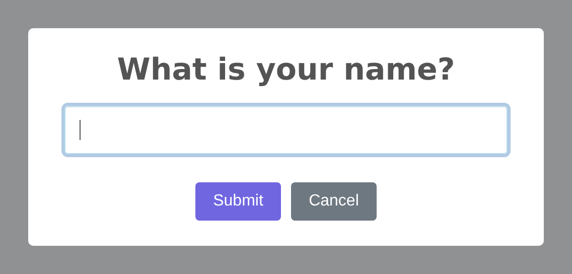
use RealRashid\SweetAlert\Facades\Alert;
use RealRashid\SweetAlert\Enums\InputType;

Alert::input('Enter your name', InputType::Text)
    ->inputPlaceholder('John Doe')
    ->confirmButton('Submit')
    ->flash();
Supported Input Types
The InputType enum provides type-safe access to all SweetAlert2 input types:
| Enum Value | HTML Input | Description |
|---|---|---|
InputType::Text | <input type="text"> | Single-line text (default) |
InputType::Email | <input type="email"> | Email with validation |
InputType::Password | <input type="password"> | Masked password input |
InputType::Number | <input type="number"> | Numeric input with spinner |
InputType::Tel | <input type="tel"> | Telephone number |
InputType::Range | <input type="range"> | Slider control |
InputType::Textarea | <textarea> | Multi-line text area |
InputType::Select | <select> | Dropdown select menu |
InputType::Radio | Radio buttons | Single-choice radio group |
InputType::Checkbox | Checkbox | Toggle/binary choice |
InputType::File | <input type="file"> | File upload |
InputType::Url | <input type="url"> | URL with validation |
InputType::Color | <input type="color"> | Color picker |
InputType::Date | <input type="date"> | Date picker |
InputType::Time | <input type="time"> | Time picker |
InputType::Month | <input type="month"> | Month picker |
InputType::Week | <input type="week"> | Week picker |
InputType::Search | <input type="search"> | Search field |
InputType::DatetimeLocal | <input type="datetime-local"> | Date & time picker |
You can also pass input types as strings if you prefer:
Alert::input('Enter your email', 'email')->flash();
Alert::input('Pick a date', 'date')->flash();
Input Configuration Methods
Placeholder
Set a placeholder for text-based inputs:
Alert::input('Enter your email', InputType::Email)
    ->inputPlaceholder('user@example.com')
    ->flash();
Default Value
Pre-fill the input with a default value using inputValue():
Alert::input('Your name', InputType::Text)
    ->inputValue(auth()->user()->name)
    ->flash();
Options for Select and Radio
When using select or radio input types, provide options using inputOptions(). The array format determines how the options are displayed:
// Simple key-value pairs
Alert::input('Select a country', InputType::Select)
    ->inputOptions([
        'US' => 'United States',
        'UK' => 'United Kingdom',
        'CA' => 'Canada',
        'AU' => 'Australia',
    ])
    ->flash();

// Grouped options
Alert::input('Select a city', InputType::Select)
    ->inputOptions([
        'North America' => [
            'NYC' => 'New York',
            'LA' => 'Los Angeles',
            'TOR' => 'Toronto',
        ],
        'Europe' => [
            'LON' => 'London',
            'PAR' => 'Paris',
            'BER' => 'Berlin',
        ],
    ])
    ->flash();
HTML Attributes
Set custom HTML attributes on the input element using inputAttributes():
Alert::input('Username', InputType::Text)
    ->inputAttributes([
        'maxlength' => 20,
        'autocapitalize' => 'off',
        'spellcheck' => 'false',
    ])
    ->flash();
Input Label
Add a visible label above the input field using inputLabel():
Alert::input('Email Address', InputType::Email)
    ->inputLabel('We will never share your email')
    ->inputPlaceholder('you@example.com')
    ->flash();
Input CSS Class
Apply a custom CSS class to the input element:
Alert::input('Search', InputType::Text)
    ->inputClass('form-control-lg')
    ->flash();
Auto-Focus
Control whether the input receives focus automatically when the dialog opens (enabled by default):
Alert::input('Optional note', InputType::Text)
    ->inputAutoFocus(false)
    ->flash();
Auto-Trim
Control whether leading/trailing whitespace is automatically trimmed from the input value:
Alert::input('Username', InputType::Text)
    ->inputAutoTrim(true)
    ->flash();
Client-Side Validation
Use inputValidator() to display an error message when the user submits without entering a value:
Alert::input('Required field', InputType::Text)
    ->inputValidator('This field is required!')
    ->flash();
When the user clicks the confirm button with an empty input, SweetAlert2 will display the validation message and prevent the dialog from closing.
TIP
For more complex validation logic (like checking against a database), use the Pre-Confirm Route feature to validate on the server side.
Server-Side Validation (Pre-Confirm)
The preConfirmRoute() method sends the input value to a Laravel route via AJAX for server-side validation before the dialog closes:
Alert::input('Enter promo code', InputType::Text)
    ->preConfirmRoute(route('validate-promo'))
    ->flash();
Your route handler should return a JSON response:
// routes/web.php
Route::post('/validate-promo', function (Request $request) {
    $code = $request->input('value');

    if (! PromoCode::where('code', $code)->exists()) {
        return response()->json([
            'valid' => false,
            'message' => 'Invalid promo code',
        ]);
    }

    return response()->json([
        'valid' => true,
        'code' => $code,
    ]);
})->name('validate-promo');
If the response contains "valid": false, SweetAlert2 will display the message as a validation error and keep the dialog open.
Complete Example
Here's a comprehensive example of an input alert with full customization:
use RealRashid\SweetAlert\Facades\Alert;
use RealRashid\SweetAlert\Enums\InputType;
use RealRashid\SweetAlert\Enums\Position;

Alert::input('Enter your email', InputType::Email)
    ->text('We will send you a confirmation link.')
    ->inputPlaceholder('user@example.com')
    ->inputValue(old('email'))
    ->inputLabel('Email Address')
    ->inputAutoTrim(true)
    ->inputValidator('Please enter an email address')
    ->confirmButton('Subscribe', '#28a745')
    ->cancelButton('Maybe later')
    ->showCloseButton()
    ->position(Position::Center)
    ->animation('animate__fadeInDown', 'animate__fadeOutUp')
    ->flash();