Toast Notifications
Toasts are lightweight, non-blocking notifications that appear in a corner of the screen and auto-dismiss after a set time. The ToastBuilder is a purpose-built builder with toast-specific defaults that make creating toast notifications effortless.
Creating a Toast
Use the toast() method on the Alert facade to create a toast. The first argument is the message, and the optional second argument is the icon type:
use RealRashid\SweetAlert\Facades\Alert;

// Simple toast
Alert::toast('Saved successfully!', 'success')->flash();

// Toast with icon
Alert::toast('Something went wrong', 'error')->flash();
Toast Defaults
The ToastBuilder automatically applies sensible defaults for toast notifications, so you don't need to configure them manually:
| Setting | Default | Why |
|---|---|---|
toast | true | Marks this as a toast (not a modal) |
position | top-end | Top-right corner for standard toasts |
showCloseButton | true | Users can dismiss manually |
showConfirmButton | false | No need for a confirm button on toasts |
timerProgressBar | true | Visual countdown indicator |
timer | 5000 | Auto-close after 5 seconds |
All defaults come from config/sweetalert.php and can be customized there.
Icon Methods
Just like AlertBuilder, ToastBuilder provides convenience icon methods:
Alert::toast('Operation complete', 'success')->flash();
Alert::toast('An error occurred', 'error')->flash();
Alert::toast('Be careful', 'warning')->flash();
Alert::toast('For your information', 'info')->flash();
Alert::toast('Do you want to continue?', 'question')->flash();
You can also chain the icon method after creating the toast:
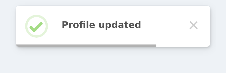
Alert::toast('Profile updated')
    ->success()
    ->flash();
Positioning
Change the toast position using position() with a string or the Position enum:
use RealRashid\SweetAlert\Enums\Position;

Alert::toast('Saved!', 'success')
    ->position('bottom-end')
    ->flash();

Alert::toast('New message', 'info')
    ->position(Position::BottomStart)
    ->flash();
Quick Position Methods
The ToastBuilder also provides shorthand position methods that eliminate the need to remember string values:
Alert::toast('Top right', 'success')->topEnd()->flash();
Alert::toast('Bottom right', 'success')->bottomEnd()->flash();
Alert::toast('Top left', 'success')->topStart()->flash();
Alert::toast('Bottom left', 'success')->bottomStart()->flash();
Alert::toast('Top center', 'success')->top()->flash();
Alert::toast('Bottom center', 'success')->bottom()->flash();
Alert::toast('Center', 'success')->center()->flash();
Auto-Close Timer
Control how long the toast stays visible using autoClose() or timer():
// Close after 3 seconds
Alert::toast('Quick update', 'success')
    ->autoClose(3000)
    ->flash();

// Close after 10 seconds
Alert::toast('Important notice', 'warning')
    ->autoClose(10000)
    ->flash();

// Disable auto-close (user must dismiss manually)
Alert::toast('Read carefully', 'info')
    ->persistent(showCloseButton: true)
    ->flash();
Timer Progress Bar
The progress bar shows a visual countdown at the bottom of the toast. It's enabled by default, but you can disable it:
// Disable progress bar
Alert::toast('No progress bar', 'success')
    ->timerProgressBar(false)
    ->flash();
Customizing Close Button
By default, toasts show a close button. You can customize or hide it:
// Hide the close button
Alert::toast('Auto-dismiss only', 'info')
    ->hideCloseButton()
    ->flash();

// Custom aria label for accessibility
Alert::toast('Accessible toast', 'success')
    ->showCloseButton('Dismiss notification')
    ->flash();
Styling Toasts
Apply custom CSS classes, background colors, and other visual customizations:
Alert::toast('Dark mode toast', 'success')
    ->background('#1a1a2e')
    ->color('#e0e0e0')
    ->customClass([
        'popup' => 'my-toast-popup',
        'title' => 'my-toast-title',
    ])
    ->flash();
Toast Hidden Behind a Navbar
A toast lives in SweetAlert2's own container, which sits at a fixed z-index. If your layout has a header, sidebar or modal with a higher one, the toast renders underneath it and looks like it never appeared.
topLayer() moves the popup into the browser's top layer, which is painted above every element on the page no matter what z-index they use:
Alert::toast('Saved', 'success')->topLayer()->flash();This is the fix whenever a toast "does not show" but you can find it in the DOM — it was there all along, just behind something. It works for modals too.
Animation
Add entrance and exit animations using Animate.css classes:
Alert::toast('Animated!', 'success')
    ->animation('animate__slideInRight', 'animate__slideOutRight')
    ->flash();
Real-World Examples
After Form Submission
public function store(Request $request)
{
    Post::create($request->validated());

    Alert::toast('Post created successfully!', 'success')
        ->position('bottom-end')
        ->autoClose(3000)
        ->flash();

    return redirect()->route('posts.index');
}
After Deletion
public function destroy(Post $post)
{
    $post->delete();

    Alert::toast('Post deleted', 'warning')
        ->flash();

    return back();
}
Using the toast() Helper
The global toast() helper function provides a convenient shortcut:
toast('Item added to cart', 'success')->flash();
toast('Operation failed', 'error')->autoClose(5000)->flash();
This is functionally identical to Alert::toast() — it's just shorter and more convenient for simple cases.